Project brief
An independent product from problem framing to working software
- Role
- Product designer & developer
- Scope
- Research framing, UX, UI, content, front-end
- Status
- Working independent product
- Audience
- Football supporters learning to interpret data
- Platform
- Responsive web application
Opportunity
Statistics answer what happened, but rarely teach someone how to interpret it.
Many football dashboards reward people who already know which metric to choose. The opportunity was to support curious supporters who can recognize a football question but may not know the analytical vocabulary behind it.
Research basis
Knowing the sport does not guarantee knowing how to read its data.
A study with twelve elite youth players at FC Nordsjælland found markedly different levels of data comprehension. Some players could only describe the values they saw, while others could interpret them and connect them to changes in their play. For one participant, a new visualization introduced confusion and was difficult to reconcile with his memory of the match.
InsightChaser researchers reviewed 204 published soccer visualization-and-text examples and interviewed six fans. Dense node-link diagrams, missing tactical context, unexplained terminology, and conclusions that skipped the reasoning process all made the analysis harder to follow.
Similar issues appeared in task-based testing of a recruitment dashboard with five professional basketball coaches. The study recorded unclear metrics and acronyms, a workflow described as not straightforward, hidden filter behavior, and no easy way to reset selections.
Design response Keep modules focused, make context and methodology visible, and place learning beside the evidence it helps explain.
Orient quicklyUnderstand the active league, team, match, and period.
Build intentionallyChoose a useful starting view without configuring everything.
Learn in contextMove between evidence and explanation without losing the question.
One question.
Two ways to understand it.
Key contributions
- Designed the dashboard’s shared context, module system, and adaptable starting layout.
- Created the course library, visual exercises, and explanatory answer feedback.
- Connected analysis and learning without losing the visitor’s investigation.
01Data dashboard
The dashboard supports different questions without asking every visitor to configure an entire workspace first.
Context bar
Keep selections consistent, with room for exceptions
Selecting a league, team, or period in the context bar updates every relevant module together. This avoids repeating the same setup in each card and makes the scope of the data easier to trust.
A module can use a different selection for comparison. The label Local override makes that exception visible, while a reset returns the card to the shared dashboard context.
- Considered
- Repeating selectors inside every module
- Chose
- One shared context with explicit local overrides
- Tradeoff
- Overrides require a visible exception state so people know which cards no longer match
Source and coverage
The Data context layer identifies the provider, selected sample, units, time zone, and where information is unavailable.
Freshness and recovery
Update times and refresh cadences stay visible. Manual refresh and retry preserve the last available snapshot when a request fails.
Methodology
Definitions and cautions explain measures such as xG, PPDA, and Pressure Index without presenting estimates as certainty.
Individual modules
One module, one clear job
Analysis is split into focused modules rather than one dense dashboard. The library groups them by Match, Team, Player, and League, and introduces each tool through the football question it helps answer.
Every entry includes a short purpose statement and visual preview. The library also recommends modules based on the current dashboard context and shows which tools pair well together, helping visitors build a more complete line of analysis without starting from scratch.
- Considered
- One fixed dashboard and long descriptions for every chart
- Chose
- Focused modules introduced by the question each one answers
- Tradeoff
- More flexibility creates more choice, so recommendations, pairings, search, and presets provide direction
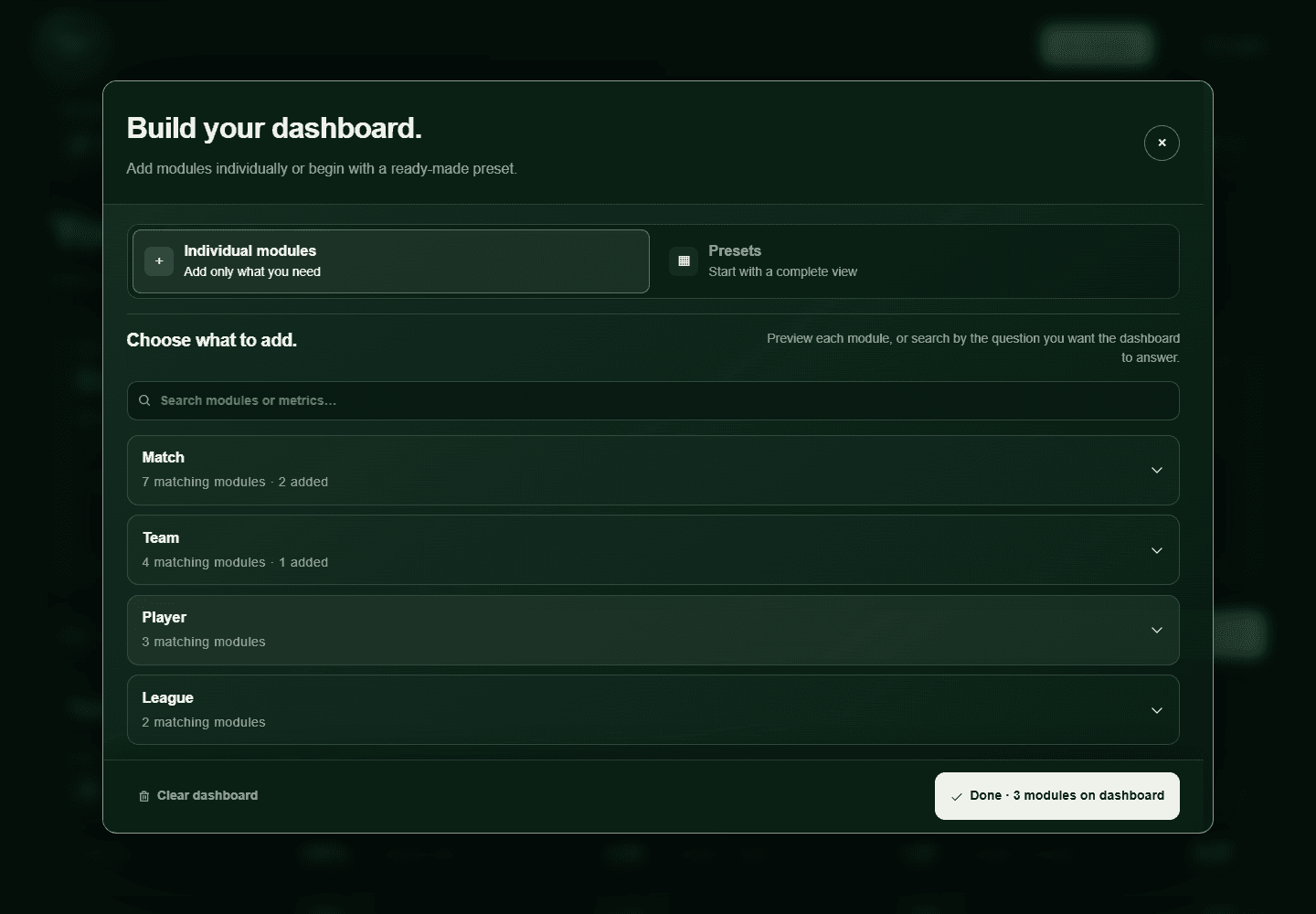
Module decision library
The rationale for each module
Match module
Match browser
What is happening across the matchweek?
- Design decision
- Combine live scores, matchweek browsing, and match detail in one entry point.
- Why it matters
- People can move from league-wide awareness to a specific match without changing tools.
Module presets
Start with a task, not an empty canvas
Seven presets combine modules around recognizable goals, from a team overview and live matchday to scouting, player evaluation, league intelligence, and fantasy research. Each creates a coherent reading order while keeping every module editable afterward.
The interface states that choosing a preset will replace the current module layout before the visitor commits, making the consequence of switching views explicit.
- Considered
- An empty canvas or silently merging every preset into the current view
- Chose
- A useful default plus task-based presets that deliberately replace the layout
- Tradeoff
- Replacement is faster and predictable, but its consequence must be stated before selection
Match browser · Ball locations · Expected metrics · Match flow
4 modulesSnapshot · Comparison · Formations · Home vs away · Fixtures
6 modulesPlayer leaders · Profiles · Player comparison
3 modulesLayout
Useful on arrival, adaptable over time
New dashboards begin with a team snapshot, recent form, and the next fixture. Together they create a simple reading order: establish the team, inspect the recent evidence, then look ahead.
Visitors can add, remove, and rearrange modules, and the layout stays in the browser. A print-friendly preview preserves the current order and selected values while removing editing controls for a calmer reading surface.
8th in league
1.52 xG / 9054% possessionSaturday · 15:00
02Learning
The learning space explains the ideas behind the charts, then asks visitors to make an interpretation of their own.
Course library
Start with a question you recognize
Twelve courses are framed around familiar football questions, from performance, territory, form, and player comparisons to technique, tactics, and Soccer IQ. Category filters and search help visitors find a useful starting point without knowing the name of a metric first.
Cards show category and difficulty at a glance. Opening the preview reveals the course summary, estimated time, and question count before the learner chooses either the theory or question path.
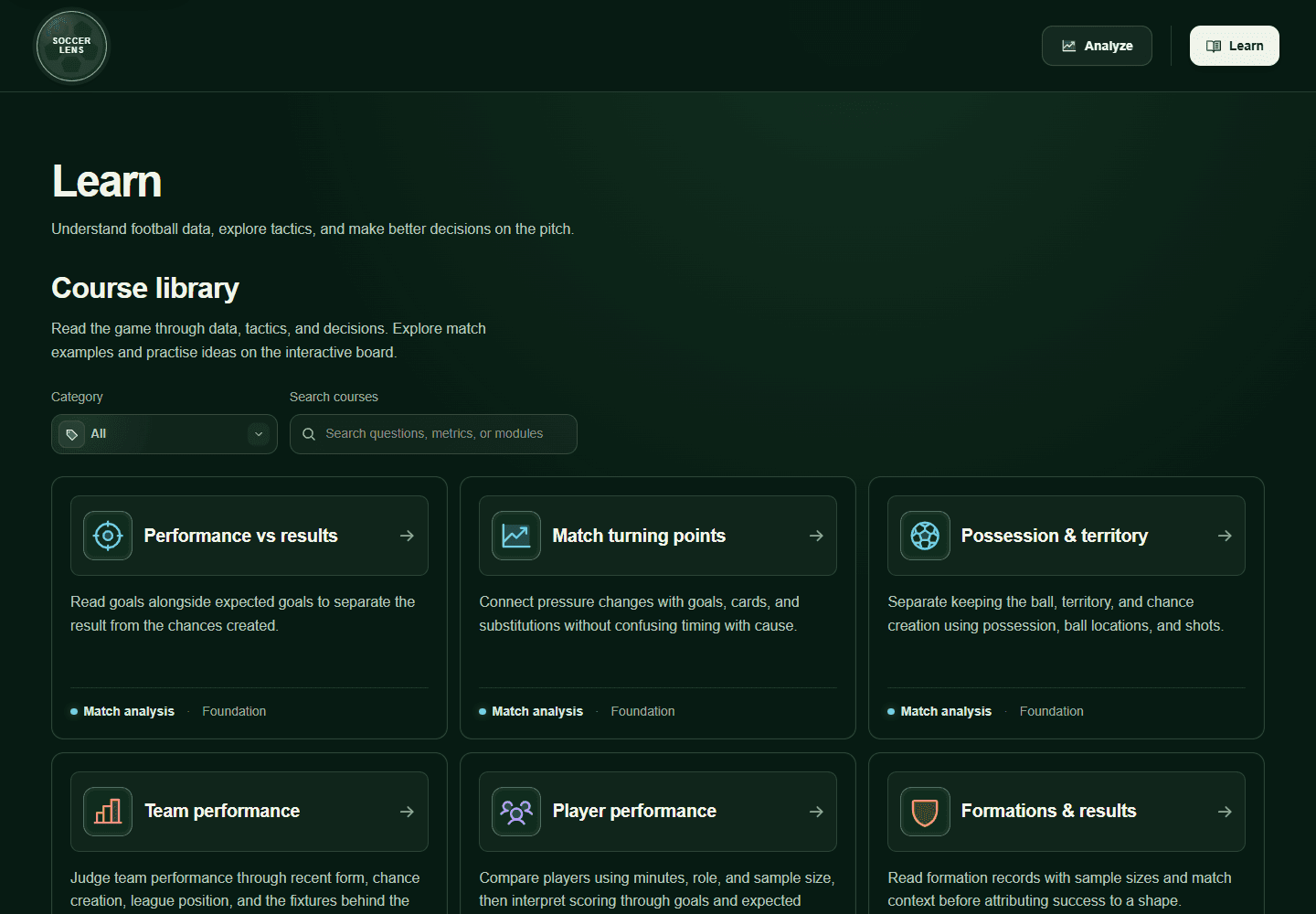
Browse by topic
Match, team, player, technique, tactics, and Soccer IQ categories extend learning beyond the dashboard’s analysis structure.
Follow a progression
Short courses move from the meaning of a metric to the judgment it supports.
Save completed work
Completed lessons are stored in the current browser. An unfinished attempt resets when the learner exits.
Lesson flow
Explain, interpret, then give feedback
Each lesson introduces a concept, works through an example, and asks the visitor to make a judgment. Visual questions keep the evidence beside the prompt, while answer-specific feedback explains the reasoning. Missed questions return in a focused review before the lesson can be completed.
- Considered
- A reference library separated from the quiz
- Chose
- Theory, worked examples, visual questions, and feedback in one lesson flow
- Tradeoff
- More guidance lengthens a lesson, so learners can enter through theory or go directly to questions
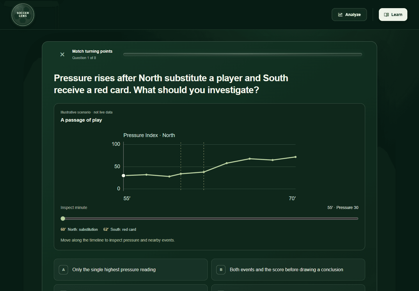
Two entry points
Learners can read the theory first or begin directly with the questions.
Review missed questions
The first pass identifies gaps, then returns only the questions that need another attempt.
Completion recap
Session time, accuracy, key takeaways, and a retake option close the learning loop.
03Cross-section connections
Opening a lesson should not mean starting an investigation over.
Preserve the investigation
A relevant lesson can open from connected analysis modules. The transition carries the applicable league, team, match, player, and comparison selections, so the learner can return to the same question with a better way to interpret it.
I deliberately avoided a one-to-one relationship between modules and courses. Some lessons connect directly to a chart or metric, while broader tactical courses stand on their own. Those courses deepen the learner’s understanding of the game, changing how they interpret evidence across every module rather than teaching a single interface.
- Considered
- A one-to-one course for every module
- Chose
- Direct links where the relationship is specific, plus independent tactical courses that influence analysis across the dashboard
- Tradeoff
- Not every course has an in-module entry point, so the library must make broader learning paths easy to discover
- 01
Notice something
A team’s results look stronger than its chance creation.
- 02
Learn how to read it
Practise comparing the result with the performance beneath it.
- 03
Apply the idea
Return to the same team, period, and comparison.
An existing module is reused. If it is missing, the relevant module is added without replacing the visitor’s layout.
04Iteration and evidence
The working product records several design changes, but user validation is still the next essential step.
Starting point
Maximum flexibility
An empty, configurable dashboard gave visitors control but asked them to understand the entire module system before receiving value.
What changed
Guided flexibility
I introduced three starter modules, task-based presets, recommendations, pairings, searchable groups, and guidance when a dashboard grows beyond eight modules.
Why it changed
Reduce setup decisions
The revised system makes a useful first view immediate while keeping the empty canvas and detailed customization available for experienced visitors.
Validation status
Implemented and quality-checked; not yet validated with target users
The product has automated regression coverage for dashboard persistence, module connections, lesson progress, data errors, and keyboard-accessible dialogs. That confirms the flows work as designed, but it does not establish that the design is understandable or useful to its intended audience.
Observe whether participants combine results, chance creation, and fixture context.
Measure whether presets, search, and module pairings lead to a focused dashboard.
Watch whether people notice the lesson link and return to the same analytical context.
Check whether participants understand that a preset replaces their current module layout.
Outcome and reflection
A modular product still needs a strong point of view about where someone should begin.
What worked
Shared context gave sixteen independent modules a coherent frame. Starter modules and presets made the first dashboard useful without removing customization.
What remains uncertain
The next study must establish whether newcomers understand recommendation labels, preset replacement, and the move from a live module into an illustrative lesson.
What I would do next
Run moderated task sessions, revise the most common wrong turns, and track module additions, abandoned preset changes, lesson starts, and successful returns to Analyze.