Designing Games for an Interactive Mobile Billboard

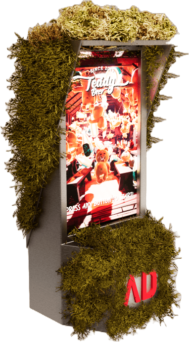
This mobile billboard was designed to travel throughout the city, allowing interactive games to be showcased at public events and high traffic locations. Players connected wirelessly via Bluetooth controllers, allowing anyone nearby to easily join the experience. Unlike traditional games, these experiences had to be understood instantly by players who had never seen them before while being visible from several meters away.

This mobile billboard was designed to travel throughout the city, allowing interactive games to be showcased at public events and high traffic locations. Players connected wirelessly via Bluetooth controllers, allowing anyone nearby to easily join the experience. Unlike traditional games, these experiences had to be understood instantly by players who had never seen them before while being visible from several meters away.

Goal

Goal

Design multiplayer experiences that attract attention, encourage participation, and showcase the capabilities of the interactive billboard.

Impact

Impact

Designed multiplayer interactions for public audiences

Improved usability through iterative playtesting

Reduced player confusion by simplifying controls

Increased spectator engagement through shared screen gameplay

Key Design Decisions

Key Design Decisions

Key Design Decisions

Simple but Effective

During early playtests we found that many participants had little or no gaming experience. Some hesitated before interacting or asked how to play, so I simplified every interaction until new players could begin almost immediately.

Length of a Session

During events, long queues quickly formed. I shortened gameplay sessions so more visitors could participate without sacrificing enjoyment.

Focus on Multiplayer

Early concepts focused on single player experiences, but we noticed that spectators often wanted to participate rather than simply watch. We shifted toward multiplayer games to increase engagement and encourage friendly competition.

How to Design for a Large Screen

How to Design for a Large Screen

How to Design for a Large Screen

Initial prototypes reused UI designed for desktop monitors. During early playtests we observed that participants naturally stood 1–2 meters from the display, so they couldn't comfortably read smaller interface elements. This introduced unique usability challenges that influenced every aspect of the interface. Ways in which I designed with this in mind include:

Increasing UI size for long distance visibility

Minimizing on screen text

Using wireless controllers that let users stand a distance away

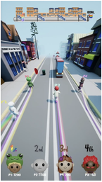
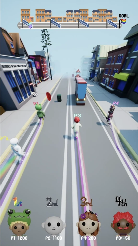
Displaying race progress and player rankings at all times

Validating comprehension and usability with frequent testing

Simplicity in Design

Simplicity in Design

Simplicity in Design

A Familiar Controller

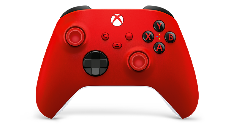
I evaluated several controller options and chose Xbox controllers because participants already understood the button layout and they provided the most reliable Bluetooth connection during testing.

Choices in Game Design

  1. I made powerups activate automatically so that players don't have to press any additional button

  2. Some participants weren't sure how far into the race they were, so I added checkpoints to communicate progression.

  3. Rapid camera movement made it difficult to track characters on a large display, so I kept the camera steady.

Intuitive Controls

I observed that introducing additional buttons slowed onboarding and caused hesitation. Limiting the controls to movement, jump, and duck allowed most players to understand the game within seconds.

Fast Onboarding

We observed that every additional menu increased drop-off, so we reduced onboarding to a few simple screens before gameplay.

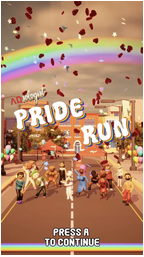
Main Menu

Character Select

In Game

A Familiar Controller

I evaluated several controller options and chose Xbox controllers because participants already understood the button layout and they provided the most reliable Bluetooth connection during testing.

Intuitive Controls

I observed that introducing additional buttons slowed onboarding and caused hesitation. Limiting the controls to movement, jump, and duck allowed most players to understand the game within seconds.

Choices in Game Design

  1. I made powerups activate automatically so that players don't have to press any additional button

  2. Some participants weren't sure how far into the race they were, so I added checkpoints to communicate progression.

  3. Rapid camera movement made it difficult to track characters on a large display, so I kept the camera steady.

Fast Onboarding

We observed that every additional menu increased drop-off, so we reduced onboarding to a few simple screens before gameplay.

Main Menu

Character Select

In Game

A Familiar Controller

I evaluated several controller options and chose Xbox controllers because participants already understood the button layout and they provided the most reliable Bluetooth connection during testing.

Intuitive Controls

I observed that introducing additional buttons slowed onboarding and caused hesitation. Limiting the controls to movement, jump, and duck allowed most players to understand the game within seconds.

Choices in Game Design

  1. I made powerups activate automatically so that players don't have to press any additional button

  2. Some participants weren't sure how far into the race they were, so I added checkpoints to communicate progression.

  3. Rapid camera movement made it difficult to track characters on a large display, so I kept the camera steady.

Fast Onboarding

We observed that every additional menu increased drop-off, so we reduced onboarding to a few simple screens before gameplay.

Main Menu

Character Select

In Game

Important Changes

Important Changes

Important Changes

Early playtests used a traditional four player split screen, where each participant had an individual camera. While this matched common racing games, participants frequently struggled to track their character from several meters away. Spectators also had difficulty following the action.

After multiple playtests, I replaced the split screen layout with a shared camera that kept every player visible simultaneously. This significantly improved readability, reduced confusion, and made the experience more enjoyable for both players and spectators.
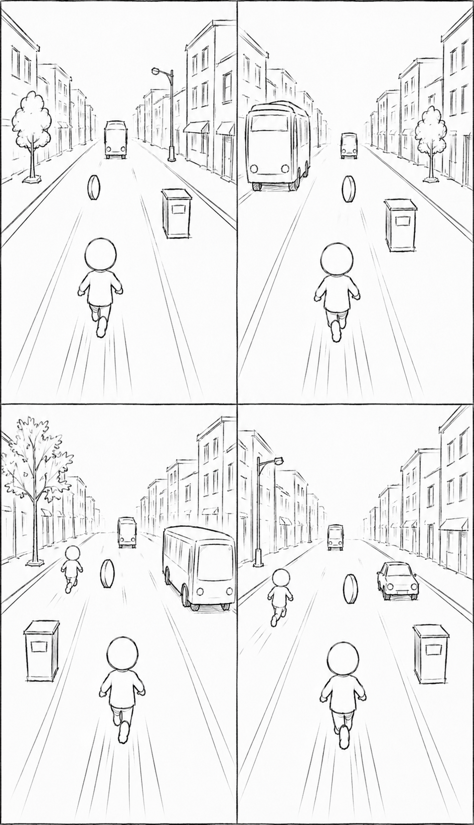
Early playtests used a traditional four player split screen, where each participant had an individual camera. While this matched common racing games, participants frequently struggled to track their character from several meters away. Spectators also had difficulty following the action.

After multiple playtests, I replaced the split screen layout with a shared camera that kept every player visible simultaneously. This significantly improved readability, reduced confusion, and made the experience more enjoyable for both players and spectators.

Early playtests used a traditional four player split screen, where each participant had an individual camera. While this matched common racing games, participants frequently struggled to track their character from several meters away. Spectators also had difficulty following the action.

After multiple playtests, I replaced the split screen layout with a shared camera that kept every player visible simultaneously. This significantly improved readability, reduced confusion, and made the experience more enjoyable for both players and spectators.

Before

Before

Before

After

After

After

Playtesting continued throughout development. I adjusted obstacle density, game speed, session length, difficulty, and randomness based on player feedback to maintain a balance between accessibility and replayability. For example, I reduced early race obstacle density after observing frequent early eliminations and shortened races after noticing long queues at events.

Key Learning Point

Key Learning Point

Key Learning Point

Designing for public spaces taught me that every second matters. When users may only interact with your product once, clarity, simplicity, and immediate engagement become the most important design principles.

Designing for public spaces taught me that every second matters. When users may only interact with your product once, clarity, simplicity, and immediate engagement become the most important design principles.